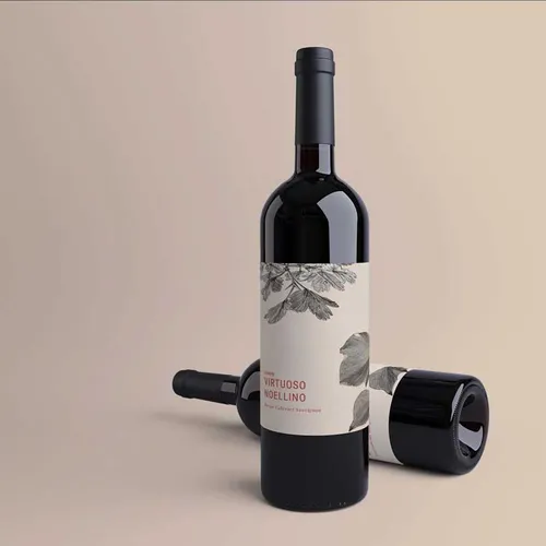
Designing Personalised Wine Labels That Capture Your Brand Story
Your wine label has to do far more work than you might think. It’s not just sitting there looking pretty on the bottle. It’s telling your story, catching eyeballs on crowded shelves, and making promises about what’s inside the bottle before anyone takes their first sip.
Getting your label design right means balancing creativity with clarity. A personalised wine label becomes your brand’s handshake with every customer who picks up your bottle. Whether you’re a boutique vineyard in the Hunter Valley or launching a new vintage, your label needs to reflect everything your brand stands for while still being practical enough to print beautifully and survive storage conditions.
Your Story Needs Sorting Before Any Design Happens
Start With Your Brand Values: Think about what makes your wine special before you touch any design software. Are you organic and earthy? Modern and bold? Traditional with a family legacy? Your label should mirror these qualities visually. A minimal, elegant design tells a different story than a vibrant, playful one loaded with illustrations.
Know Your Audience Inside Out: Picture the person buying your wine. Are they grabbing it for a casual dinner or selecting something special for a celebration? Young wine enthusiasts respond to different design cues than collectors seeking premium bottles. Understanding this shapes everything from your colour psychology choices to the formality of your typography.
Identify What Sets You Apart: Your vineyard’s location, winemaking method, or unique grape varieties all deserve consideration. Maybe your sustainable practices or award-winning blend should take centre stage. These details become visual anchors that help your label stand out when shoppers are scanning dozens of options.
Pick Your Vibe and Run With It
Typography Tells Your Tale: Fonts carry massive weight in label design. Serif fonts often suggest tradition, craftsmanship, and premium quality. Sans-serif options feel contemporary and approachable. Script fonts can add elegance but become hard to read if overused. Pick two fonts maximum for your label, one for your brand name and another for supporting information.
Colour Choices Create Instant Connections: Deep burgundies and golds scream luxury and age-worthiness. Bright, unexpected colours suggest fun and approachability. Pastels might work beautifully for rosé or lighter wines. Your colour palette should align with your wine type and target market while standing out enough to catch attention in retail environments.
Imagery That Resonates: Whether you choose illustrated vineyard scenes, abstract patterns, or minimalist graphics, your imagery needs purpose. It should reinforce your story without cluttering the design. Some of the most memorable wine labels use simple, striking visuals rather than trying to squeeze in every detail.
The Art Meets the Must-Haves
Legal Requirements Come First: Australian wine labels must include specific details like alcohol content, volume, producer information, and allergen warnings. These aren’t optional, so design around them rather than treating them as afterthoughts. Smart designers make regulatory text feel integrated rather than awkwardly tacked on.
Hierarchy Guides the Eye: Your brand name typically deserves the most prominent placement, followed by the wine variety or blend name. Supporting details like vintage year, region, and tasting notes sit lower in the visual hierarchy. This creates a natural reading flow that doesn’t overwhelm at first glance.
White Space Works Wonders: Don’t try to fill every millimetre of your label. Strategic white space lets important elements breathe and prevents your design from feeling cluttered. Sometimes what you leave out matters as much as what you include.
Getting Technical Without Getting Boring
Material Matters for Longevity: Paper labels offer a classic, tactile feel and work beautifully for wines stored in controlled conditions. Polypropylene labels provide water resistance and durability, crucial for wines that spend time in ice buckets or refrigerated displays. Your material choice affects both aesthetics and practicality.
Resolution and File Preparation: Design your artwork at high resolution, typically 300 DPI minimum. Blurry labels scream amateur hour and damage brand perception. Working with proper colour profiles ensures what you see on screen matches what comes off the press. These technical details separate professional results from disappointing ones.
Consider Your Printing Method: Different printing techniques suit different design approaches. Digital printing offers flexibility for short runs and variable data, perfect for limited releases or personalised bottles. Understanding your production method early prevents design disappointments later.
See also: Exotic Car Rental Dubai | Discover Power, Prestige, and Pure Luxury
Don’t Make These Rookie Mistakes
Avoid these blunders that trip up even experienced designers:
- Overcomplicated designs that confuse rather than communicate your message clearly.
- Illegible fonts that look beautiful but can’t be read from a normal viewing distance.
- Poor contrast between text and background making information difficult to decipher quickly.
- Ignoring how labels look when bottles are grouped together on shelves or displays.
- Forgetting about label edges and how design elements align with bottle curves.
What’s Hot in Wine Label Design Right Now
Minimalism Continues Its Reign: Clean, simple designs with plenty of breathing room appeal to modern consumers seeking quality over flash. This approach puts focus squarely on your brand name and wine variety without distraction.
Illustrated Labels Gaining Ground: Hand-drawn or artistic illustrations create unique, memorable labels that feel personal and craft-focused. This style works particularly well for smaller producers wanting to emphasise their artisanal approach and attention to detail.
Sustainable Messaging Visible: Eco-conscious consumers want to see your environmental commitments reflected visually. Whether through earthy colour palettes, recycled label materials, or certification badges, sustainability has become a design consideration rather than just a production choice.
Time to Bring Your Vision to Life
A brilliant wine label doesn’t happen by accident. It’s the result of thoughtful planning, clear brand understanding, and attention to both creative and technical details. Your label represents your wine when you can’t be there to pour it yourself, so invest the time to get it right.
Ready to bring your wine label vision to life? Start by sketching out your brand story and the visual elements that best represent it. Then explore material options and printing methods that suit your production needs and budget. Your perfect label is waiting to tell your story on every bottle.